Visual Page Builder
Create stunning websites without writing code using WavyKits' powerful visual page builder. Start with a blank canvas, drag and drop widgets, use AI to generate components, and export clean production-ready code.
Building Made Simple
WavyKits features a powerful visual page builder that lets you create websites visually. Start with a blank canvas or template, customize everything in real-time, and export clean code built with modern web technologies.
Drag & Drop
Intuitive interface for building layouts visually.
AI Powered
Generate components by describing what you need.
Real-time Customization
Live preview with instant styling changes.
Page Building Workflow
Follow these four steps to build any page:
- Choose Method — Start with drag & drop, components, or AI generation
- Build Layout — Design your page structure with visual tools
- Customize Style — Fine-tune colors, fonts, spacing, and animations
- Export Code — Download clean, production-ready code
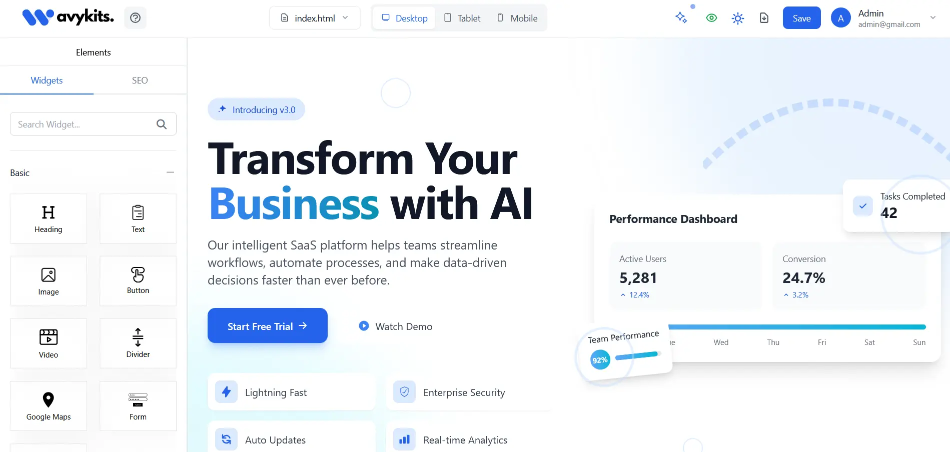
Drag & Drop Interface
The drag and drop interface makes building websites intuitive and fast. Simply select components from the sidebar and drag them onto your canvas.

How to use drag & drop:
- Browse the component library in the left sidebar
- Click and hold on any component you want to add
- Drag the component to your desired position on the canvas
- Drop it when you see the blue drop zone indicator
Component Customization
Every component can be fully customized using the property panel. Select any element to access its styling and content options:
- Content — Edit text, headings, images, links, and form fields
- Styling — Colors, backgrounds, typography, spacing, borders, and shadows
- Layout — Responsive breakpoints, flexbox/grid, position, and dimensions
Containers, Grids & Tables
Structure your content with containers, grids, and tables for responsive layouts:
- Containers — Flexible containers for grouping elements with customizable spacing. Quick Add: Click "Add Container" then click widgets to populate — no dragging needed!
- Grid Layout — Responsive grid systems with customizable columns. Quick Add: Add grid, then click components to fill cells automatically!
- Data Tables — Interactive tables with sorting and filtering. Quick Add: Create table, then click to add rows and columns!
AI-Powered Generation
Describe what you want and let AI create the perfect component. Our system understands your requirements and generates tailored components instantly.
AI features include smart content analysis, automated optimization, single-section and full-page generation, and multi-model support with 6 AI models to choose from.
Text-to-Website AI
Describe your website in plain text and let WavyKits AI build it for you. Simply type a description of what you want — the layout, content, style — and the AI generates a full page ready for customization.
How it works:
- Open the Page Builder and click the AI Generate button
- Choose Text-to-Website mode
- Describe what you want in natural language
- Select your preferred AI model and generate
- Edit and refine the result in the visual editor
Image-to-Website AI
Upload a screenshot, mockup, or design image and let WavyKits AI convert it into a fully functional website. The AI analyzes the visual structure, colors, layout, and content to produce clean Tailwind CSS code.
Supported inputs:
- Screenshots — Capture any website and recreate it
- Mockups — Upload Figma, Sketch, or Photoshop exports
- Hand-drawn sketches — Even rough wireframes work
How it works:
- Open the Page Builder and click the AI Generate button
- Choose Image-to-Website mode
- Upload your image (PNG, JPG, or WebP)
- The AI analyzes the layout, typography, and colors
- Review and customize the generated page in the visual editor
SEO Optimization
WavyKits includes a built-in SEO analyzer that scores your pages in real-time and provides actionable suggestions. Get your pages search-engine ready without leaving the builder.
SEO features include:
- Real-time SEO Score — Instant scoring as you build
- Meta Tags — Title, description, and Open Graph tag management
- Heading Structure — Automatic heading hierarchy analysis
- Image Optimization — Alt text reminders and dimension suggestions
- Content Analysis — Keyword density and readability checks
- Performance Tips — Suggestions for faster loading pages
Responsive Design
WavyKits supports responsive design out of the box. Preview your pages at different breakpoints and adjust layouts for desktop, tablet, and mobile screens. Every component automatically adapts to different screen sizes with mobile-first design principles.